I'm pretty nerdy when it comes to my interests, and when I find a new one I get deeply enthralled in it.
I recently started reading a Manga series called Psyren and I started on issue 114 out of some random notion because I was waiting on other Manga series to come out. Well an image caught my interest. At first I sat looking at for a few minutes wondering if he (Kyle) was floating after being hit, or if someones ability was to alter space. Then I thought maybe he's on the offensive. In actuality he is on the offensive and his speed is demonstrated well in the image. Not quite as well as the artist/writer, Toshiaki Iwashiro, demonstrates here.
With all that said, I started to think about how different artists is manga show the same things. In addition, how all of that differs from American comics.
I'm a little stingy when it comes to my interests. I like comics, but mostly action comics. I like manga way more than comics, but only those with a good plot and interesting worlds/abilities/fights/etc.
One of my favorites, and one of the best examples I was going to use Soul Eater recently got suspended, unlucky. But almost the same attack here is show so differently that the one here. It doesn't seem like much, but the artist of Psyren shows the impact of the slam with a number of small lines rather than an almost an explosion bubble like Hiromu Arakawa shows in Full Metal Alchemist. Even the punches thrown... Greed in Full Metal Alchemist, his attack is just there, right beside Wrath's head. Where as Shao's movements in Psyren are almost blurry, but still have a great deal of direction and a lot more movement.
Manga is written by one person as a long standing series, most often in black and white, which creates more difficulty that American comics because color adds a lot. Comics, by American standards exist as a series, the most popular ones have several writers and several artists, as well inkers, and people to do the color. So the art style of American comics literally could vary from week to week or month to month depending on the frequency of which it's released. This for example, is Super Man. Look at how the impact of the car is shown with junk a bent hood and some debris along with a bring color scheme of yellow to draw your attention to the release of energy exerted by force. It's done a lot in comics. In this a large difference of sequence is used to show the Joker being hit. Batman winds up, then the Joker is through the room. You're mind fills in the rest.
Honestly, observing the styles of different artists is really interesting. It's really noticeable very quickly in comics because of how people demonstrate the way they perceive the physics of actions. Then, how do you translate that into an image? It's something that goes very unnoticed, but next time you crack open the Sunday comics in your newspaper, don't just look at how different each of the characters are drawn, look at the shading, is colored in? Is it darker from color? Is a black spot? Is it several lines? Is it cross-hatched lines? Is the action fluid and believable or is it jumbled and choppy.
It's a whole new world to observe just on a single newspaper page! Have at it!
Thursday, May 13, 2010
Tuesday, May 4, 2010
Dual-Wielding Advertisements
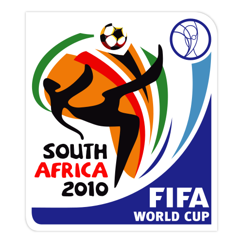
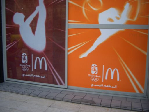
I was eating dinner tonight and looked over at a Coca-Cola box that's geared up in collaboration with the 2010 FIFA World Cup and I thought to myself how impressive Coke's advertising group must be.
To shed a little light on this, they probably had absolutely nothing to do with the design firm that organized that World Cup's advertising but instead had to master that style and make it fit Coke's style. This is an absolutely ridiculous thing to do. It's entirely fusing two organized establishments and combining them into an ad that makes both establishments represented without over powering either establishment to make them equal.
Looking at the two ads its obvious where they differ and where they are the same. This isn't the first ad I've seen like this, but most ads for larges scale events like that just have "Proud Sponsor of the ------------" underneath the logo. For example McDonalds doesn't actually advertise their own scheme, they've just attached they're logo to another ad. Not real creative on either part.
Honestly, I'm glad organizations wants to sponsor the same thing, but a little creativity on the part of the establishment attaching it's name to an event would be nice. So Kudos to you Coca-Cola for dividing up the spoils to represent yourself as well as the event you are tagging your products reputation along with.
Subscribe to:
Posts (Atom)